On-the-water Feedback
You can swipe between several screens showing metrics or graphs showing boat, oar, or seat data or graphically screens shown below under “On-the-water Rowing Screens”
On-the-Water Rowing Screens
- What does the Quiske App measure? What numerical immediate feedback is there?
- Numerical immediate Feedback: The default screen showing eight (or four if you prefer less) tiles with traditional metrics such as SPM, speed, and distance but most interesting from the rowing performance point of view are the metrics from the oar or seat sensor: You can see the arc length of your oar work in real-time, or, the maximum seat speed during the drive. Each tile can be freely configured by long-pressing the tile.
- Graphical Immediate Feedback: Blade Flight Path, Blade Angular Velocity or Seat Velocity (note they use the same Quiske Pod), Acceleration/Deacceleration.
More Detailed Graphically Analysis Available After Uploading the Data
Boat Acceleration / Deacceleration Curve (Solid Lines) Relative Boat Velocity Curve

The first graph shows the acceleration of the boat during the previous stroke. When rowing, the boat velocity fluctuates in rhythm with the strokes. The oars propel the boat forward during the drive, and this accelerates the boat. The rowers’ movement back and forth relative to the boat accelerates and deaccelerates the boat, and the Quiske App gives instant feedback on when and by how much the boat is speeding up or slowing down during the previous stroke. The shape of the curve and the max and min values depend very much on the rowing technique and give information on the rowing efficiency. The y-axis shows the acceleration in m/s^2, whereas the x-axis shows the normalized time without units, and the x-axis is auto-scaled to fit one entire stroke cycle from catch to finish no matter what the stroke rate is. If the “y”-value is positive, it means that the boat is accelerating, and you can easily see during which part of the stroke this happens by having a look at what part of the curve is above the x-axis.
If you’ve strapped the RowP pod to an oar, the following screens show feedback on how you are moving the oar. The first graph shows the path of the blade during one full stroke. The pod measures the rotation in all three directions to calculate the oar’s full path both horizontally and vertically.
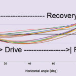
Blade Flight Path:

This graph visualizes how the oar is moving up and down as well as back and forth. The shape of the blade flight path reveals how the rower is handling the oar at the catch, during the drive, at the finish, and during the recovery giving valuable insight into the technique. On both axes’ we have degrees. All values are relative, not absolute. In fact, each curve starts from “0-point” on the y-axis, where the blade enters the water, at the catch continues counter-clockwise and returns to the release where the blade exits the water. Then the cycle repeats at the catch “0” point on the vertical (y-axis). The difference between the length of recovery and the blade exits the water and then enters the water. The drive’s length shows the efficiency of the stroke and shows the amount of slip on each end of the stroke.
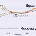
The Performance Curve (Angular Velocity of the blade relative to Time)
This curve shows the angular velocity of the oar in the horizontal direction. The values and especially the shape of the performance curve reveal a lot about the rowing technique. The higher the angular velocity of the oar is when the oar is in the water, the higher the force that is applied to the boat is, in other words, the performance curve is related to the power curve but is different in that it is useful also for analyzing not only the drive phase but also the recovery.
If the performance curve has very steep sides when it crosses the x-axis, the rower quickly changes the motion direction. You can also see how even the distribution of power is during the drive and whether recovery is smooth or speeding up towards the catch. The location of the maximum angular velocity during the drive and recovery can be analyzed in detail in the web portal (read more below). This is especially helpful for crew members to row in synchrony and thus gain efficiency and speed.
If you’ve attached a pod to the seat, the Quiske App doesn’t show any oar graphs (the blade flight path and performance graphs above) but shows the velocity of the speed during one full stroke instead:
Seat Velocity Curve (alternative placement)
The seat speed is positive during the drive and negative during recovery. Of course, the speed is 0 when the seat is stationary.
You need to press record to store data from your rowing for uploading to our web portal for more detailed analysis. Stop recording when you’re finished with your piece. Short recordings are enough to see the signature rowing style of a rower. When you’re finished with your rowing, you can go to Sessions to upload all sessions you want to store. The sessions remain locally on your phone until they are uploaded or until you delete them. Remember to close the App to disconnect from the sensor finally. Remember to charge your sensor every session.
All recorded data can be uploaded to the Quiske Rowing Performance web portal, which can be accessed with your Rowing Performance account login. Sessions are uploaded from the Rowing Performance App in the Sessions tab.
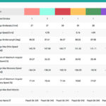
 Numerical Data Available After Upload: (See and “click” photo to Enlarge)
(Note: For Erg Use: See the Quiske Rowing Performance website for more information on how to use and analyze this system’s use with rowing machines.)